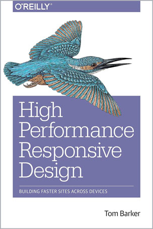
Building Faster Sites Across Devices
Tom Barker

#Design
#Sites
#SLAs
#PhantomJS
#Web_Applications
Yes, you can use responsive web design to create high performance, compelling websites. With this practical book, author Tom Barker demonstrates that responsive design is not just a frontend-only approach, but also a philosophy for taking advantage of the entire web stack. Responsive design patterns and anti-patterns, derived from heavily used real-world sites, are guiding principles throughout the book.
Ideal for frontend-focused web developers, this book shows you how to incorporate responsiveness and performance into your project plan, use Node.js for device-specific functionality on the backend, and write automated tests for a continuous integration environment. You’ll explore many useful tools and responsive frameworks, and gain useful insights from Barker’s own experience with responsive design along the way.
- Get a primer on web performance concepts, web runtime performance, and performance tracking tools
- Write functionality with Node.js that serves up a device-specific experience to the client
- Explore client-side solutions, such as lazy loading entire sections of a page―including images, styling, and content
- Validate service level agreements (SLAs) by writing automated tests with PhantomJS
- Examine several responsive frameworks, including the author’s server-side framework, Ripple
Table of Contents
Chapter 1: State of the Industry of Responsive Design
Chapter 2: Primer on Performance of Web Applications
Chapter 3: Start with a Plan
Chapter 4: The Backend
Chapter 5: The Frontend
Chapter 6: Continuous Web Performance Testing
Chapter 7: Frameworks
About the Author
Tom Barker is a software engineer, an engineering manager, a professor and an author. Currently he is Director of Software Engineering and Development at Comcast, and an Adjunct Professor at Philadelphia University.


