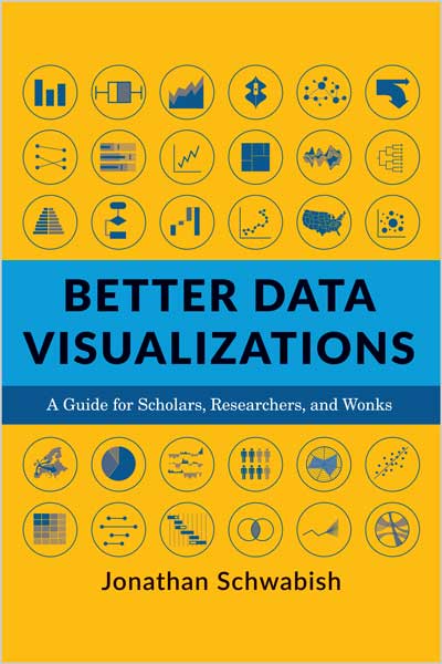
A Guide for Scholars, Researchers, and Wonks
Jonathan Schwabish

#Data
#Visualizing
#Chart
پیشنهاد میکنیم به دلیل وجود نمودارهای رنگی در تعداد زیادی از صفحات، این کتاب را چاپ رنگی سفارش بدهید
Now more than ever, content must be visual if it is to travel far. Readers everywhere are overwhelmed with a flow of data, news, and text. Visuals can cut through the noise and make it easier for readers to recognize and recall information. Yet many researchers were never taught how to present their work visually.
This book details essential strategies to create more effective data visualizations. Jonathan Schwabish walks readers through the steps of creating better graphs and how to move beyond simple line, bar, and pie charts. Through more than five hundred examples, he demonstrates the do’s and don’ts of data visualization, the principles of visual perception, and how to make subjective style decisions around a chart’s design. Schwabish surveys more than eighty visualization types, from histograms to horizon charts, ridgeline plots to choropleth maps, and explains how each has its place in the visual toolkit. It might seem intimidating, but everyone can learn how to create compelling, effective data visualizations. This book will guide you as you define your audience and goals, choose the graph that best fits for your data, and clearly communicate your message.
Review
An excellent primer for anyone who wants to display quantitative information clearly and powerfully. -- Robert B. Reich, Chancellor’s Professor of Public Policy, University of California at Berkeley, and former U.S. secretary of labor
This is an immensely practical guide to more effective communication through data visualization. From basic principles, to an extensive taxonomy of visualization types, to developing a style guide, this will be an invaluable and accessible read for anyone who needs to turn data into information. -- Mara Averick, RStudio
Too often, good data falls prey to bad or lazy visualizations. At last, an indispensable guide for presenting your work intelligibly and compellingly. -- DJ Patil, former U.S. chief data scientist
For many of us, it’s tough to understand data without visuals. But visualizing data is hard! This book is the authoritative guide. It’s terrific―and spectacularly useful. -- Cass R. Sunstein, Harvard Law School, and author of Too Much Information
A stellar variety and number of visualizations are included in these pages, an enjoyable-to-read encyclopedia of graphs. Jonathan Schwabish provides practical considerations for when to use which visual and thoughtful design guidelines in this excellent resource for those who work and communicate with data. You’ll be inspired and―as promised―learn better data visualization! -- Cole Nussbaumer Knaflic, author of Storytelling with Data: A Data Visualization Guide for Business Professionals
Navigating the myriad chart types available today can be a daunting experience. This book provides you with not only a guiding light but also an important foundation in the burgeoning field of data visualization. You will want to keep its set of principles and guidelines right next to you in your next project. -- Manuel Lima, author of The Book of Circles: Visualizing Spheres of Knowledge
Better Data Visualizations carefully teaches the reader when to use which type of visualization and why. This engaging book takes you from the basics to the entire breadth of today’s visualization methods. There are hundreds of clear, elegant, and varied visualizations to give you ideas for your own work. -- Max Roser, founder and director, Our World in Data
Better Data Visualizations is a practical guide to a large catalogue of chart types. No other book introduces the reader to specific chart types with such detail and finesse. It is an excellent resource for students, analysts, and researchers alike. -- Alberto Cairo, author of How Charts Lie: Getting Smarter About Visual Information
Not only is the book well designed from fonts to white space, it’s also well written and enjoyable to read. ― Technical Communication
About the Author
Jonathan Schwabish is an economist and writer, teacher, and creator of policy-relevant data visualizations. He helps nonprofits, research institutions, and governments at all levels improve how they communicate their work and findings to their colleagues, partners, clients, and constituents. He is the author of Better Presentations: A Guide for Scholars, Researchers, and Wonks (Columbia, 2016).


